Logo and identity
Dār Riwāq al-Turāth
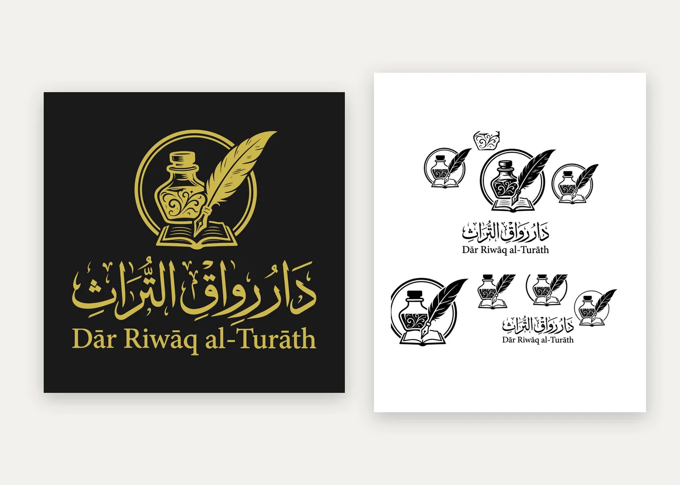
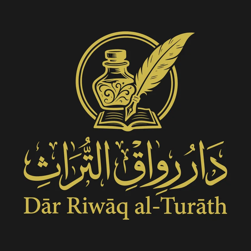
A logo for a publisher of classical Islamic texts: an inkwell, a quill and an open book, under the publisher’s name in fully vowelled calligraphy, in gold on black and in solid black.
- What we did
- Logo design · Arabic calligraphy · Identity files
- Sector
- Islamic publishing
- Client
- Dār Riwāq al-Turāth
- Type
- Client project
- Status
- Logo delivered
Who it’s for
Dār Riwāq al-Turāth, a new publisher of classical texts with checked references, and the readers and booksellers who will recognise its books on a shelf.
The problem
A publisher’s mark lives on spines, title pages and small social images as well as on covers. It had to read as scholarly rather than commercial, carry the Arabic name with its vowel marks exactly right, and still hold together when printed tiny or in one colour.
What was built
A mark of an inkwell, a quill and an open book, the tools of copying and studying texts, set in a ring. Beneath it, the publisher’s name in calligraphy with every vowel mark in place, and the name in English. The final logo comes in gold on black for covers and in solid black for one-colour printing, with the mark on its own for small spaces.
- An inkwell, quill and open book, drawn as one mark
- The Arabic name in calligraphy with full vowel marks, checked letter by letter
- The English name, Dār Riwāq al-Turāth, set beneath in a classical serif
- Gold on black for covers, solid black for one-colour printing
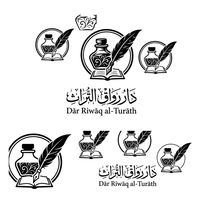
- The mark alone for spines, favicons and small spaces
- Already in use on the cover of Tahdhīb al-Faqīh wal-Mutafaqqih
Process
From brief to handover
How the work moved, step by step.
The brief
A mark for a publisher of classical texts that reads as scholarly, carries the Arabic name exactly, and works on a spine as well as a cover.
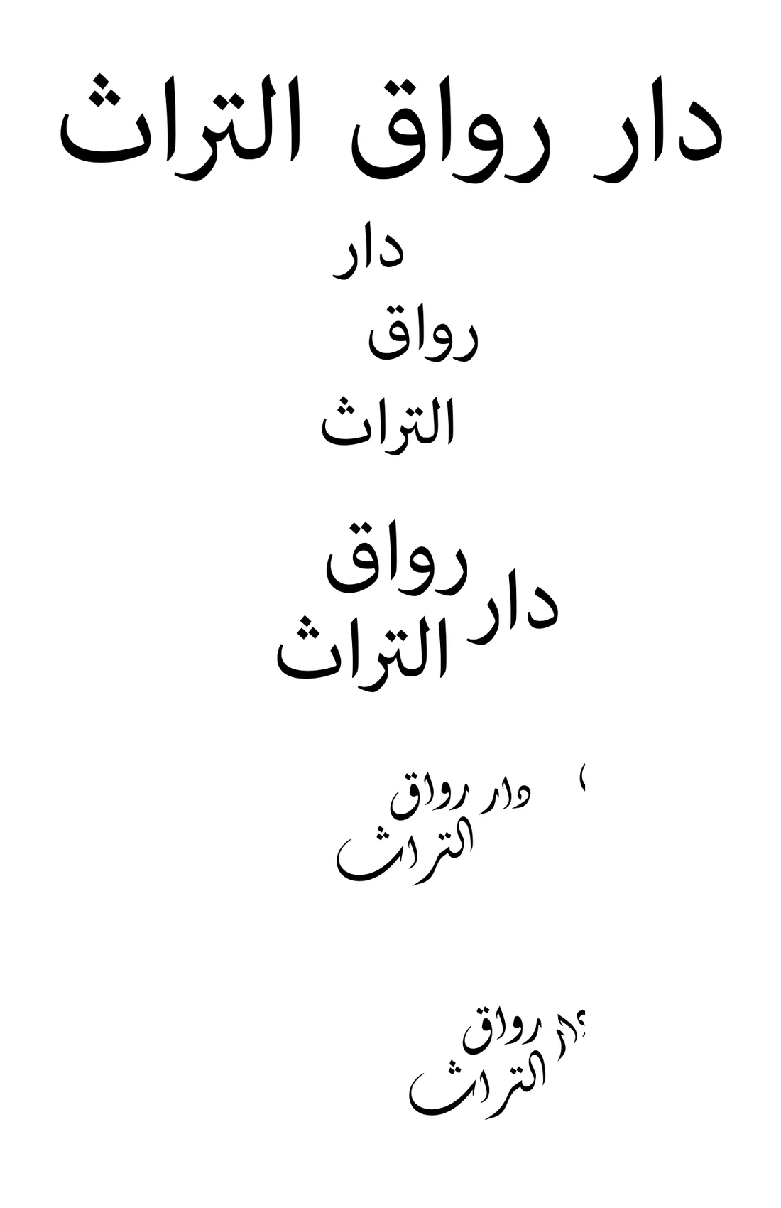
Name studies
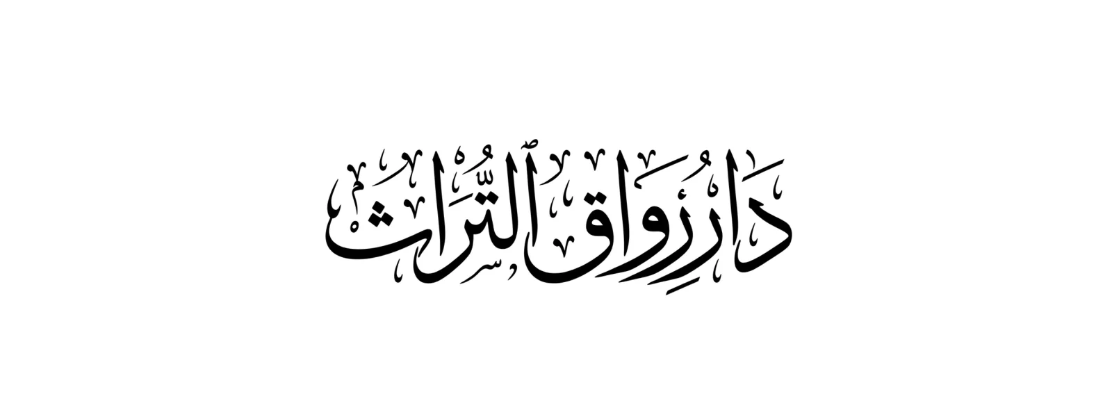
The name set on one line, stacked and sketched, to find how the words sit together.
The mark
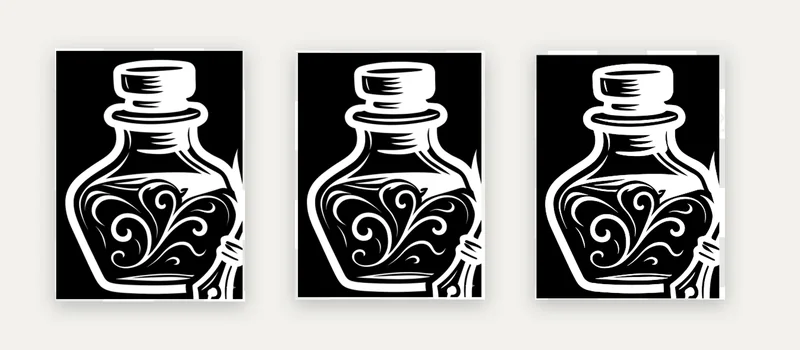
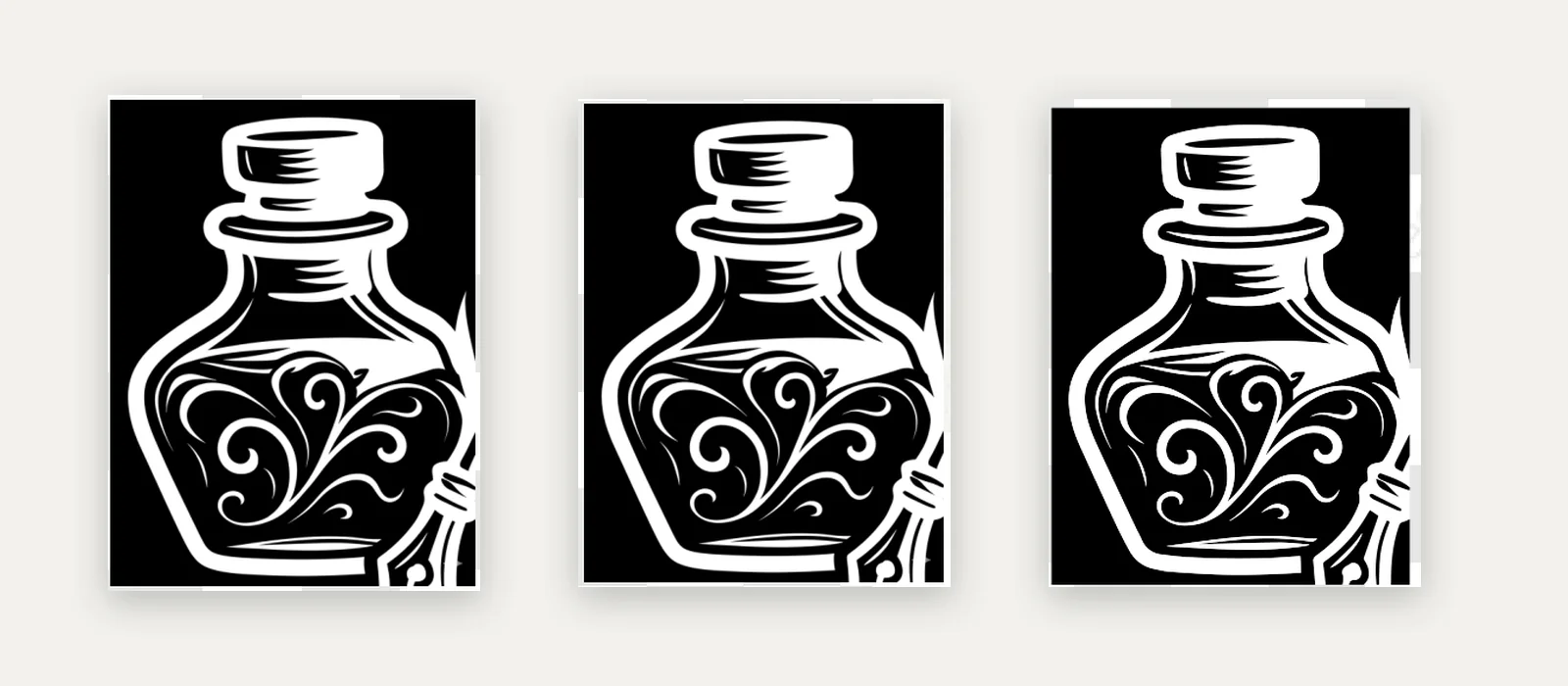
An inkwell, a quill and an open book, drawn several ways, then simplified for small sizes.
 (opens a larger view)
Lockups
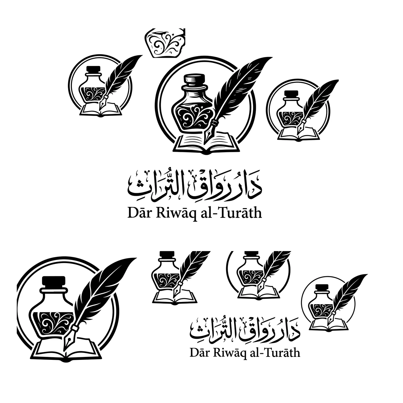
The mark with the Arabic and English name, and the mark alone, in solid black.
 (opens a larger view)
Vowel check
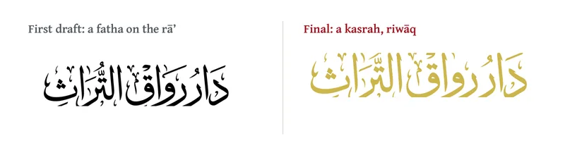
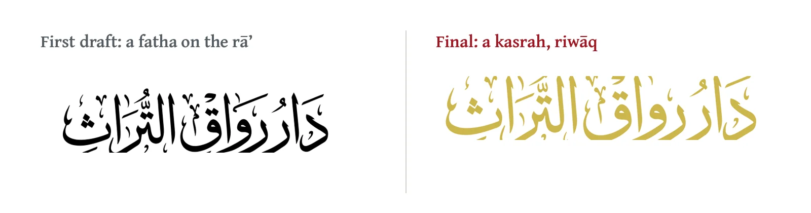
Every vowel mark checked; the first letter of riwāq corrected to a kasrah.
 (opens a larger view)
Gold and black
The final colourway for covers, with black for one-colour printing.
 (opens a larger view)
Design notes
How the mark came together
Starting with the name
The first studies set دار رواق التراث in plain type: on one line, stacked word by word, and in loose calligraphic sketches, to see how the three words want to sit together.
The tools of the work
A riwāq is a covered gallery, the kind of space where students gathered to read and copy books. The mark draws on that work rather than on the building: an inkwell with a quill resting in it, over an open book.
Drawn, then simplified
The inkwell was drawn several times, with different bottle shapes and decoration, then simplified so its curls and the quill still read at the size of a book spine.
Every vowel in place
The name carries full vowel marks, as a carefully copied text would. One was corrected before release: the first letter of رِواق takes a kasrah (riwāq), not the fatha of the first draft.
The work
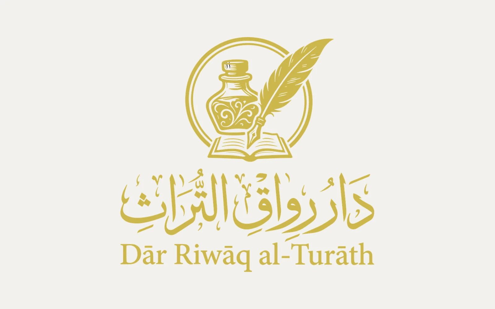
The final logo
Gold on black for covers and marketing, and gold on a light ground.
The work
From studies to system
Name studies, the inkwell drawings, and the set of marks and lockups in solid black.
 (opens a larger view)
 (opens a larger view)
 (opens a larger view)
 (opens a larger view)
 (opens a larger view)
The work
In use
The publisher’s mark at the foot of a book cover.
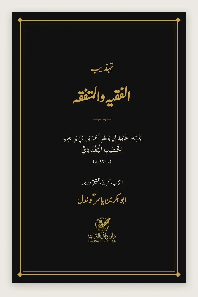 (opens a larger view)
Handover
What the client received
The publisher received the logo ready for print and screen.
- Gold on blackFor covers, banners and social media
- Gold on transparentFor placing on light or photographic backgrounds
- Solid blackFor one-colour printing and stamps
- Mark aloneFor spines, favicons and small spaces
- Source fileThe editable Illustrator file
Dār Riwāq al-Turāth and its logo, artwork and content belong to the client. Shown here as an example of our work.
Start here
Need something
like this?
Tell us about your project and mention Dār Riwāq al-Turāth. We’ll explain how we’d approach yours and what it would cost.
- A reply from a real person
- Written quote before work starts
- You own everything at handover