The best free fonts for business websites, including Arabic and Urdu
Twelve free Google Fonts we’d choose for a business website, with their weights, languages and licence, plus the best options for Arabic and Urdu text.
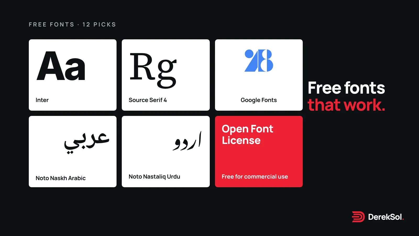
Choosing a typeface is one of the cheapest decisions in a website that makes a visible difference. You don’t have to pay for one: Google Fonts has hundreds of good families, and its FAQ says plainly that they are all free, can be used commercially, and can be used in a logo.1
The hard part is choosing. Below are the twelve we’d actually reach for on a business website, grouped by job, with the facts that matter: who designed it, which weights it has, and which languages it covers. Every family listed is published under the SIL Open Font License, checked in the Google Fonts repository on 10 November 2026.2
How we chose
- Readable at small sizes on a phone, because that’s where most visitors read.
- A variable version or a full range of weights, so headings and body text come from one family.
- Language coverage that suits the business: Latin with accents at minimum, and Arabic or Urdu where needed.
- Free for commercial use, with the licence stated by the source.
For text and headings (Latin)
| Font | Weights | Designer | Also covers |
|---|---|---|---|
| Inter | 100–900, optical sizes | Rasmus Andersson | Cyrillic, Greek, Vietnamese |
| Manrope | 200–800 | Mikhail Sharanda | Cyrillic, Greek, Vietnamese |
| DM Sans | 100–1000, optical sizes | Colophon Foundry | Latin only |
| Source Sans 3 | 200–900 | Paul D. Hunt | Cyrillic, Greek, Vietnamese |
| IBM Plex Sans | 100–700, widths | Mike Abbink, Bold Monday | Cyrillic, Greek, Vietnamese |
| Noto Sans | 100–900, widths | Cyrillic, Greek, Devanagari, Vietnamese |
Weights, designers and languages from Google Fonts’ own font data, 10 November 2026.3
1. Inter
The safe, excellent default. Inter has a weight axis from 100 to 900 and an optical-size axis that adjusts letter shapes for small and large text.3 It’s a good fit for software, dashboards and any site with a lot of interface text.
2. Manrope
Slightly warmer and more geometric than Inter, with weights from 200 to 800.3 It’s the typeface this website uses, because it stays clear in long body text and looks confident in big headings.
3. DM Sans
Friendly and compact, with a weight range up to 1000 and optical sizes.3 Latin only, so pair it with something else if you need other scripts.
4. Source Sans 3
Adobe’s open-source workhorse, designed by Paul D. Hunt, with weights from 200 to 900.3 Calm and very readable for content-heavy sites.
5. IBM Plex Sans
Technical and precise, with a width axis as well as weights from 100 to 700.3 It has a matching Arabic family (below), which makes bilingual sites easier to keep consistent.
6. Noto Sans
Google’s family built for language coverage; the wider Noto collection covers more than 1,000 languages and over 150 writing systems.1 Choose it when a site must show many scripts in one consistent style.
For a serif touch
7. Source Serif 4
A sturdy reading serif from Frank Grießhammer, with weights from 200 to 900 and optical sizes, so it works for long articles and display headings alike.3
8. Lora
A softer serif with weights from 400 to 700, popular for blogs and editorial headings.3
For Arabic
9. Noto Naskh Arabic
A clear Naskh, the style most readers expect for running Arabic text, with weights from 400 to 700.3 A safe choice for body copy.
10. Amiri
A classical Naskh by Khaled Hosny and Sebastian Kosch, in regular and bold with italics.3 It suits Qur’anic and classical quotations, and it’s the Arabic typeface we use on this site. Give it a larger size and generous line height so the vowel marks have room.
11. IBM Plex Sans Arabic
A modern Arabic sans serif drawn to sit beside IBM Plex Sans, by Mike Abbink, Bold Monday, Khajag Apelian and Wael Morcos.3 Good for interfaces and bilingual business sites.
For Urdu
12. Noto Nastaliq Urdu
Urdu readers expect Nastaliq, the flowing, slanted style of Urdu books and newspapers. Noto Nastaliq Urdu provides it in weights from 400 to 700.3 Nastaliq needs much more line height than Latin text, so test it with real paragraphs, not a single heading. For Urdu interfaces where Nastaliq is too tall, a Naskh such as Noto Naskh Arabic is a practical alternative.
Google’s servers or your own?
You can load these fonts from Google’s servers with a link, or download them and host them yourself. Google says its font service doesn’t set cookies and doesn’t use the data to profile visitors, but each visitor’s browser does send Google its IP address, the page address and browser details.1 If you host the files yourself, Google receives nothing about your visitors.1 This site self-hosts its fonts for that reason, and because it removes a connection to another server before the text can show.
Two common mistakes
- Too many families. One family for everything, or one for headings and one for text, is plenty. Every extra file slows the first view.
- Faux bold and italics. If you use a weight or italic you didn’t load, the browser fakes it and it looks smudged. Load what you use.
Font names are trademarks of their owners where registered. DerekSol is not affiliated with Google or any designer named here.
References
Footnotes
-
Google Fonts. Frequently asked questions. Read 10 November 2026. ↩ ↩2 ↩3 ↩4
-
Google. google/fonts repository on GitHub, licence field in each family’s METADATA.pb under the
oflfolder. Read 10 November 2026. ↩ -
Google Fonts. Font metadata: axes, designers and language subsets for each family. Read 10 November 2026. ↩ ↩2 ↩3 ↩4 ↩5 ↩6 ↩7 ↩8 ↩9 ↩10 ↩11 ↩12