Logo, identity and intro animation
Markaz Athari
An Arabic calligraphy logo for an Islamic learning centre, with a full file set and a short logo intro. Their website is in progress.
- What we did
- Logo design · Arabic calligraphy · Identity files · Logo animation
- Sector
- Islamic education
- Type
- Client project
- Status
- Logo delivered · Website in progress
Who it’s for
An Islamic learning centre that publishes lessons and material online, and needed one mark that works on a lesson thumbnail, a printed booklet, a favicon and a stamp.
The problem
The name had to read clearly in Arabic and English, the mark had to suit serious religious content without looking like a corporate badge, and it had to survive being tiny on a phone as well as large on a banner.
How the intro came together
Reference first
The centre sent a short reference clip and the piece of sound they wanted. We timed every version of the intro to that sound.
Version one: weight
The first intro raised the calligraphy as a solid, three-dimensional piece and turned it into place. It worked, but it felt heavier than the mark itself.
Version two: the pen
The second draws the roundel line by line, as if by pen, over a faint star-and-hexagon pattern, then fills it in and brings in the name.
Final: the letters as background
The agreed version keeps the pen-drawn reveal, but replaces the pattern with large, soft strokes taken from the letters themselves, so the whole frame belongs to the logo.
What was built
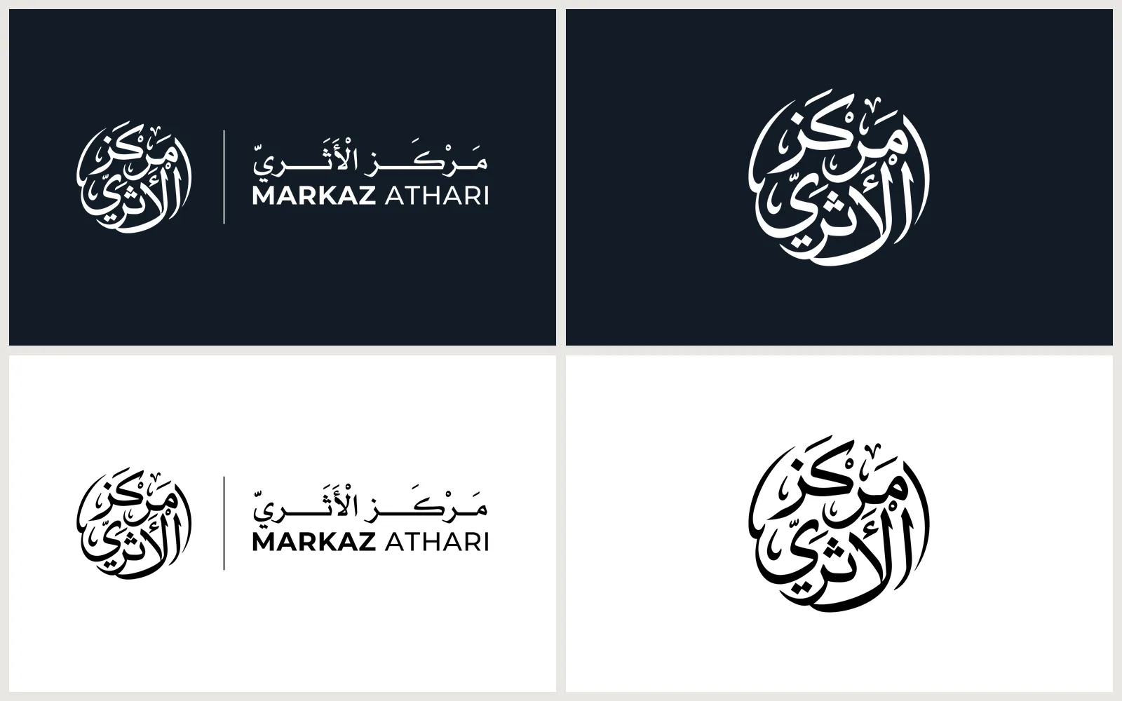
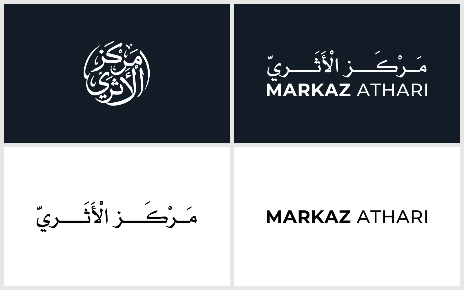
The final logo: the centre’s name written as a calligraphy roundel, in horizontal, vertical, symbol-only and name-only layouts, in the one colour the centre chose, a deep blue-black (#121B26), with white and black versions. Social media sizes, app icons, and a short animated intro built on the final logo.
- An Arabic calligraphy roundel, chosen over an earlier geometric draft
- Horizontal, vertical, symbol-only and name-only layouts
- One colour, #121B26, with white and black versions
- PNG, SVG, PDF and EPS files, social media sizes, favicons and app icons
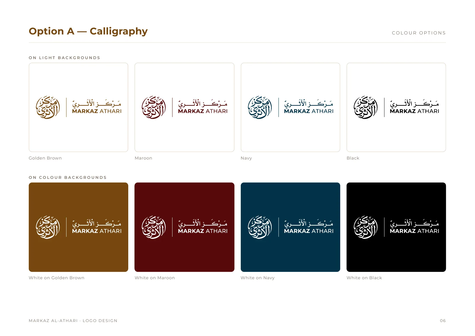
- Earlier drafts in golden brown, maroon and navy, with a guidelines document
- A logo intro animation, refined over three versions
Process
From brief to handover
How the work moved, step by step.
The brief
One mark for lesson thumbnails, printed booklets, a favicon and a stamp. It had to read in Arabic and English and suit serious religious content.
First drafts: a ring
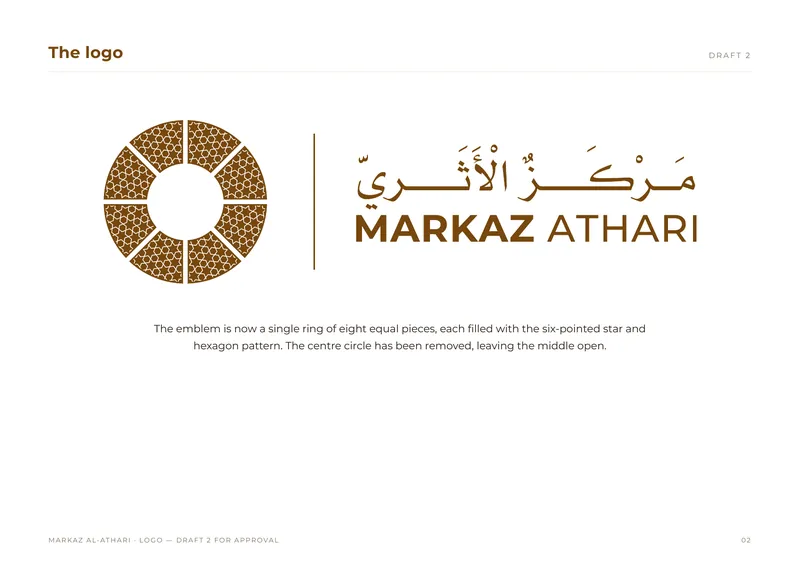
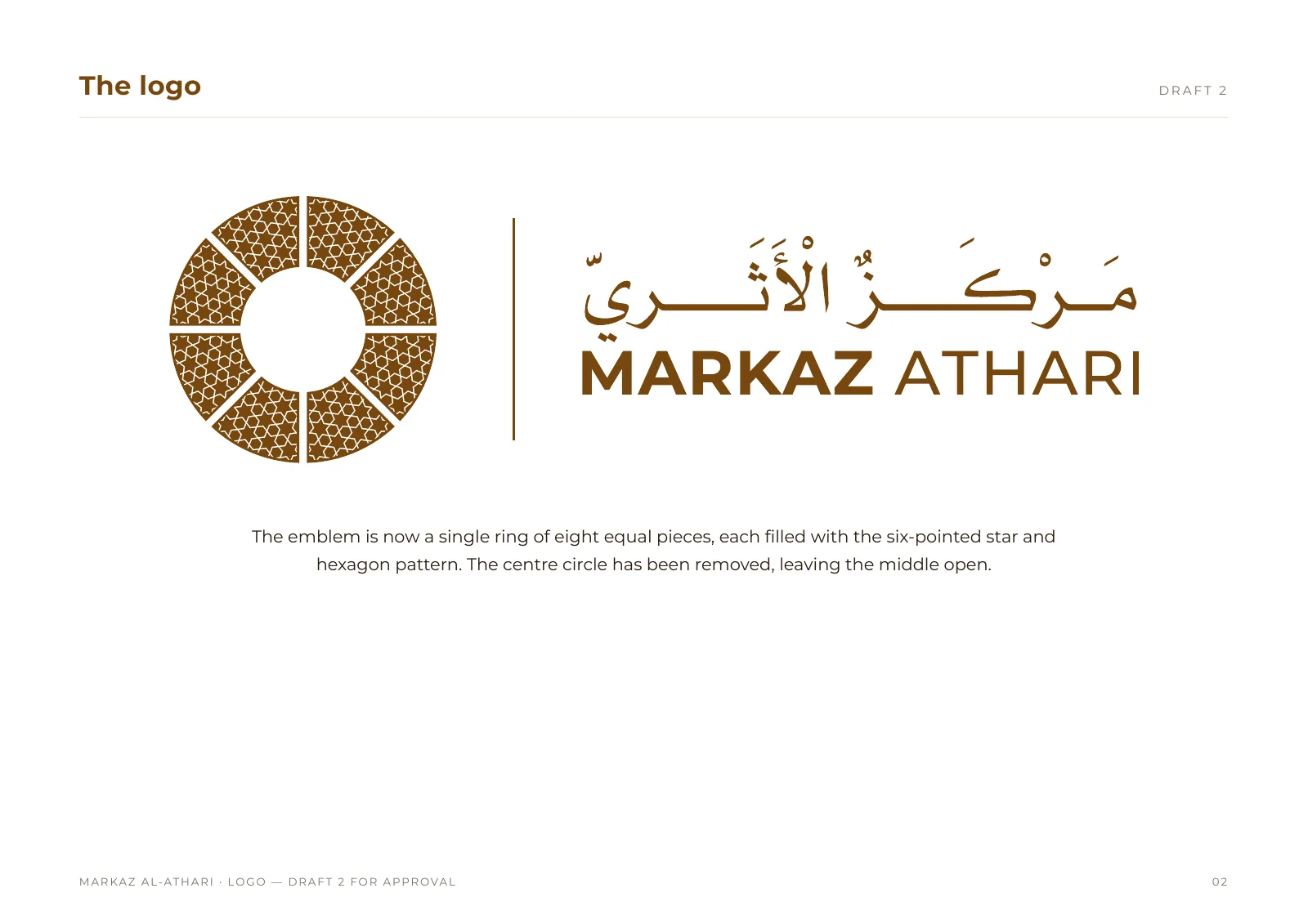
Eight identical star-and-hexagon pieces around an open centre. Careful geometry, but not yet this centre’s own.
 (opens a larger view)
A new direction: the name
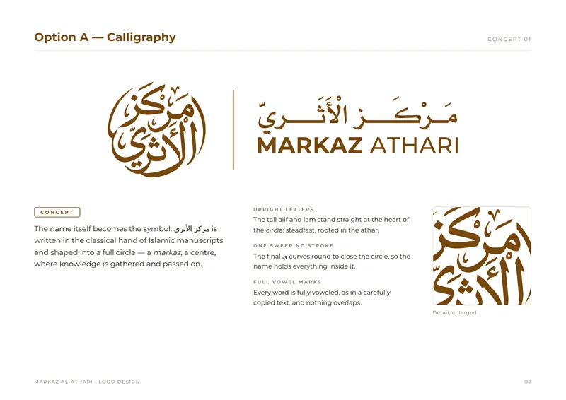
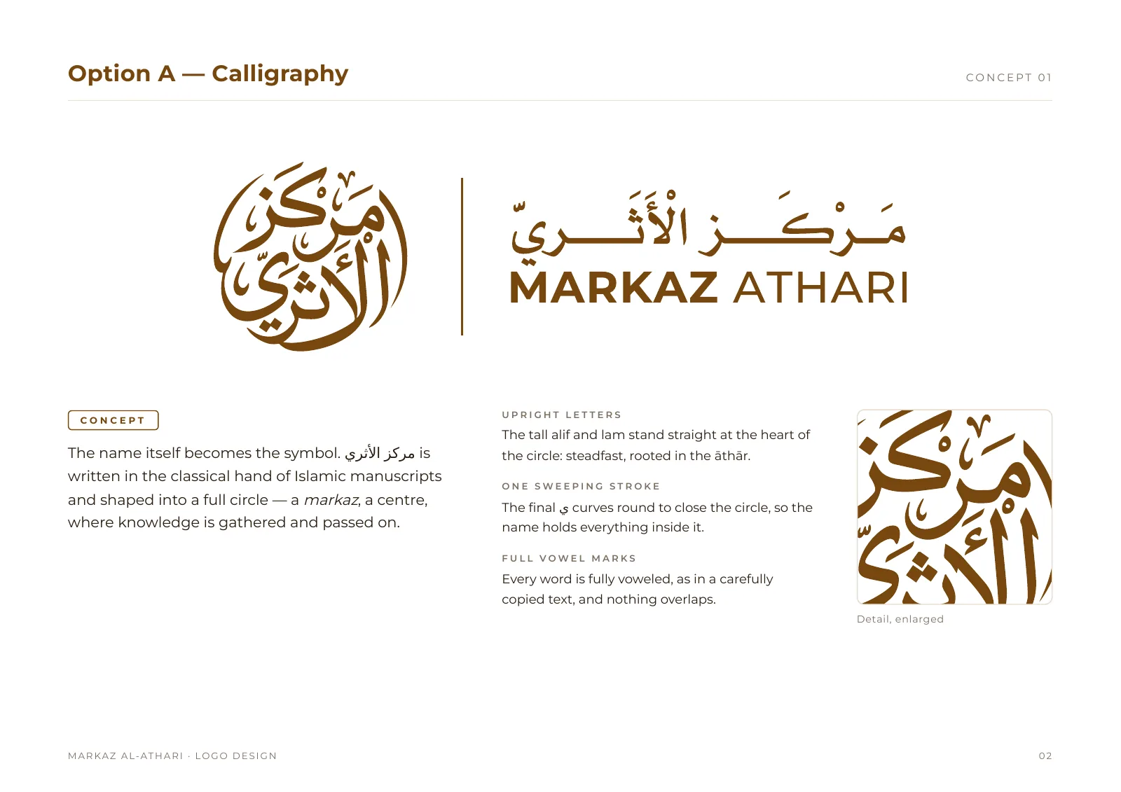
The name written as a closed calligraphy roundel, with every vowel mark in place.
 (opens a larger view)
Colour rounds
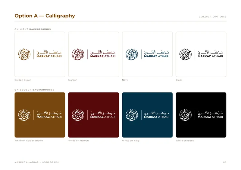
Golden brown, maroon and navy, each with its own guidelines. None of them settled.
 (opens a larger view)
The final colour
One deep blue-black, #121B26, the colour of the centre’s videos. Every layout redrawn in it, with white and black.
 (opens a larger view)
Tested in use
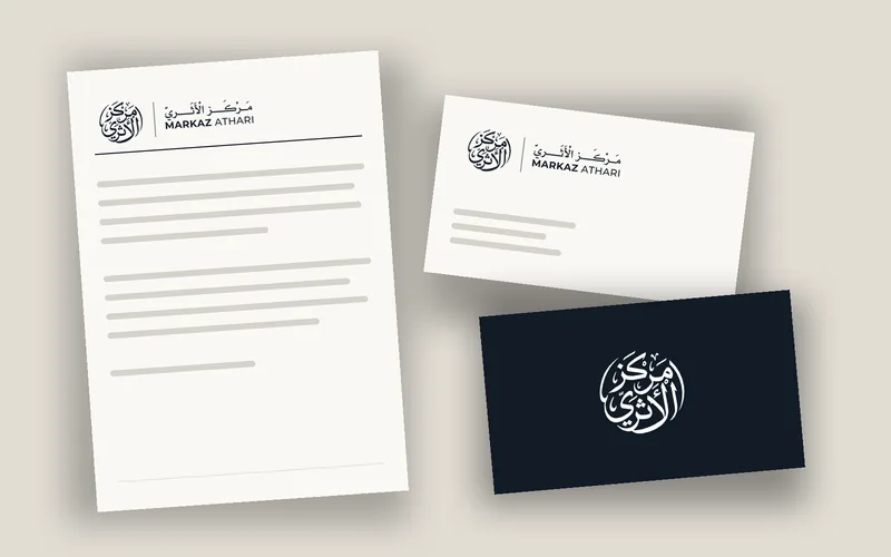
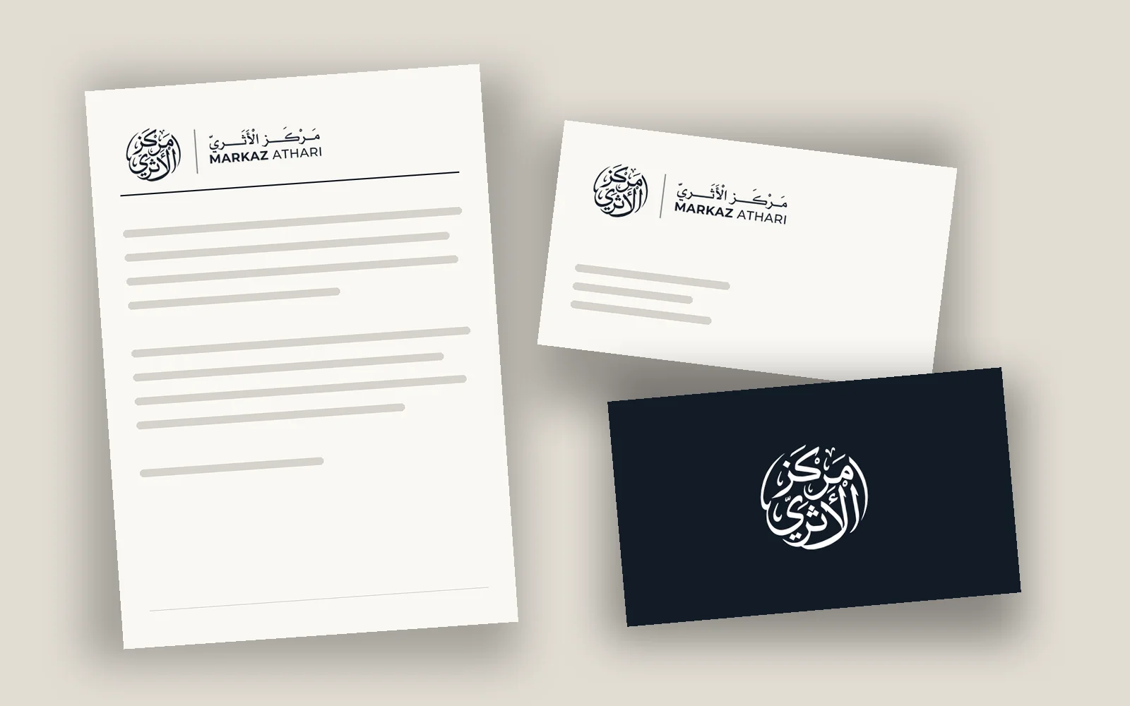
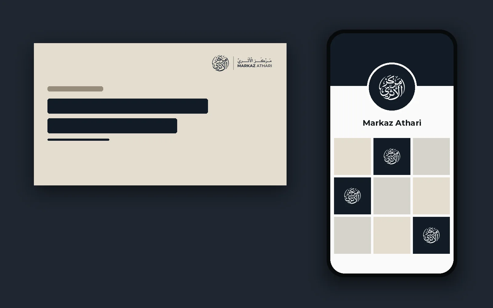
Checked on stationery, a phone profile, a lesson thumbnail and a sign before anything was signed off.
 (opens a larger view)
The intro
Three versions, timed to the sound the centre chose, until the pen-drawn reveal was agreed.
 (opens a larger view)
Handover
One organised folder with a short read-me, so a printer or a web developer can find the right file without asking.
Design notes
The thinking behind the mark
Where it started
The first drafts were geometric: a ring of eight identical pieces around an open centre, each filled with six-pointed stars and hexagons drawn on the grid of Islamic tilework. It was careful work, but geometry like that belongs to the whole tradition. The centre’s own name could say more.
The name becomes the mark
In the final draft the name itself became the symbol: مركز الأثري written as one closed roundel. In the manuscripts a centre like this reads from, the title is often the ornament. A markaz is a centre, a place people gather around, and a circle says that without borrowing a picture from anywhere else.
Upright letters, one closing stroke
The tall alif and lām of al-Athari stand straight at the middle of the circle and hold it steady. A single sweeping stroke of the final yā’ comes round and closes the ring. Every word carries its full vowel marks, the way a carefully copied text would, and no letter is allowed to sit on top of another.
Two scripts, one weight
The Arabic is set in a classical naskh, strengthened so it sits evenly beside the English. The English is Montserrat, open and plain, so it supports the Arabic rather than competing with it. A thin rule separates the two in the horizontal layout.
One colour
The drafts offered golden brown, maroon and navy, each with its own guidelines. None of them settled. The centre chose a single deep blue-black, #121B26, the colour of its videos and the logo intro, and we redrew everything in it: the full logo, the symbol alone and the name alone, on light and on dark, with plain black and white for one-colour printing.
The work
The final logo
The calligraphy roundel in its one colour, #121B26: the full logo and the symbol on dark and light, the name on its own, the app icon and a social media cover.
The work
In use
The final logo checked where it will actually live: stationery, a phone profile, a video thumbnail and a sign at the door. Mock-ups, made to test the logo before sign-off.
 (opens a larger view)
 (opens a larger view)
 (opens a larger view)
The work
The logo intro
The agreed version first, then the two earlier versions. Sound on: each one is timed to the audio the centre chose.
Handover
What the client received
Everything arrived in one folder, sorted by where each file is used, with a short read-me explaining which file to pick.
- 01 HorizontalSymbol and name side by side, for the website header, letterhead and signs
- 02 VerticalSymbol above the name, for square spaces, posters and book covers
- 03 Symbol onlyFor small spaces, watermarks and seals
- 04 Social mediaProfile picture and cover banners sized for YouTube, Facebook, LinkedIn and X
- 05 Website and app iconsFavicons from 16 to 48 px, home-screen and app icons up to 1024 px
- Name onlyThe Arabic and English name without the symbol
- #121B26 setThe final colour: full logo, symbol and name, on light and on dark
- FormatsPNG for everyday use, SVG for the web, PDF and EPS for print and signage
- FontsMontserrat and Al Mohannad, with licence notes
- Intro videoThe agreed logo intro as a 1080p MP4
Markaz Athari and its logo, artwork and content belong to the client. Shown here as an example of our work.
Start here
Need something
like this?
Tell us about your project and mention Markaz Athari. We’ll explain how we’d approach yours and what it would cost.
- A reply from a real person
- Written quote before work starts
- You own everything at handover